

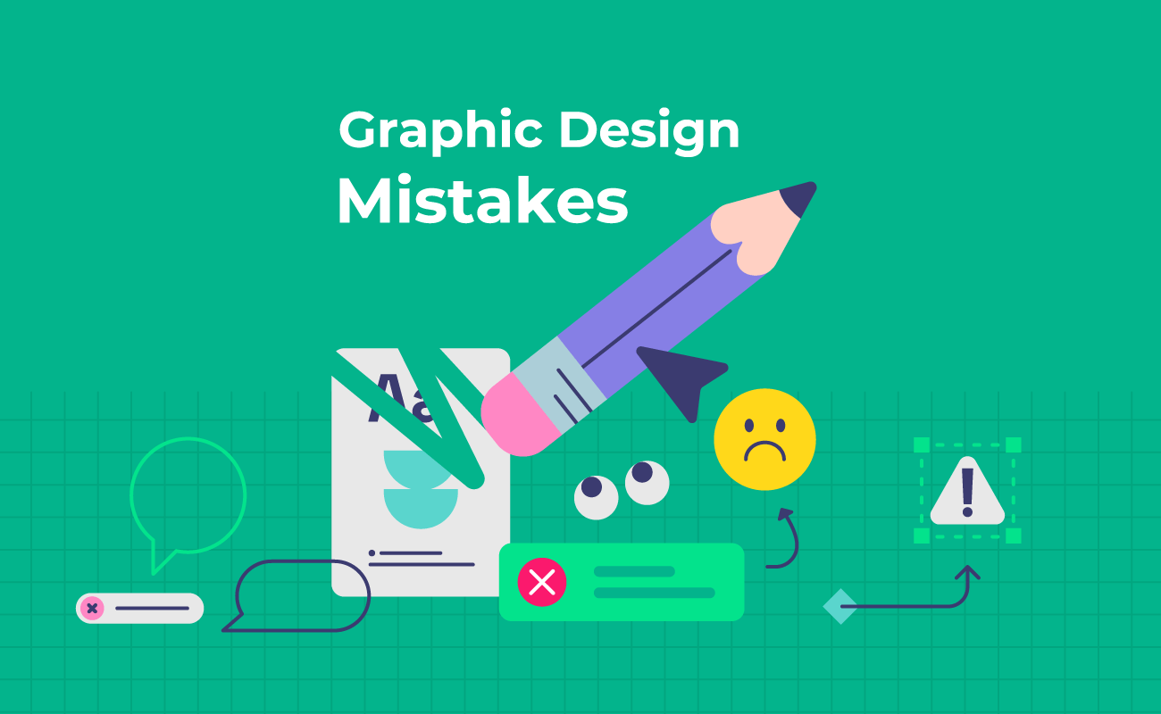
5 Basic Mistakes Every Graphic Designer Should Stop Making
Graphic design is not just about making something look attractive. A good design should communicate a message clearly, guide the viewer's attention, and serve a specific purpose.
However, many graphic designers, especially beginners, make small mistakes that can make an otherwise good design look unprofessional.
The good news is that most of these mistakes are easy to fix once you know what to look for.
Here are five basic graphic design mistakes every designer should stop making.
1. Using Too Many Fonts
One of the most common mistakes is using too many fonts in a single design.
A designer may choose one font for the heading, another for the subheading, another for the body text, and several more for different elements. Instead of making the design interesting, this usually creates visual confusion.
A professional design often needs only two or three fonts.
For example, you can use:
- One strong font for headings
- One readable font for body text
- An optional accent font for small supporting elements
The goal is not to show how many fonts you can use. The goal is to create a clear visual hierarchy.
Simple rule: If every piece of text looks different, nothing looks important.
2. Ignoring Alignment and Spacing
A design can have great colors, typography, and images but still look unprofessional because the elements are not properly aligned.
Random spacing between headings, images, buttons, and paragraphs makes a design feel messy.
Good designers pay attention to:
- Consistent margins
- Equal spacing
- Grid alignment
- Text alignment
- Proper padding
- Relationships between elements
Spacing is not empty space that needs to be filled. White space is an important part of the design.
3. Trying to Put Everything Into One Design
Another common mistake is trying to communicate too much at once.
A poster, social media graphic, banner, or advertisement may contain a headline, several messages, multiple images, icons, contact information, a logo, discounts, badges, and decorative elements.
The designer may think more information makes the design more useful.
Usually, it does the opposite.
When everything demands attention, the viewer doesn't know where to look first.
A better approach is to ask:
What is the most important message?
Make that message visually dominant. Then organize the supporting information around it.
A strong design doesn't necessarily say more. It communicates the important thing faster.
4. Using Low-Quality or Poorly Chosen Images
Images have a major impact on the quality of a design.
Using a blurry, pixelated, stretched, badly cropped, or irrelevant image can immediately make a design look amateur.
Another common mistake is stretching an image to fit a layout without considering its original proportions.
Instead:
- Use high-quality source images
- Maintain the correct aspect ratio
- Crop intentionally
- Check image resolution before exporting
- Make sure the image supports the message
Also, don't choose an image simply because it looks beautiful.
Ask yourself:
Does this image actually communicate something relevant to the design?
A beautiful image that doesn't support the message can still be the wrong image.
5. Designing Without Understanding the Purpose
Perhaps the biggest mistake is starting the design before understanding what the design is supposed to achieve.
A graphic designer should know:
- Who is going to see this?
- What is the main message?
- Where will the design be used?
- What action should the viewer take?
- What information is most important?
- What brand or visual style should it follow?
A social media post, website banner, presentation slide, product advertisement, and printed brochure may all require completely different design decisions.
Designing without understanding the purpose often leads to a visually attractive design that doesn't actually solve the client's problem.
Good Design Is About Decisions, Not Decoration
Graphic design is not about adding more colors, effects, shadows, icons, or visual elements.
It is about making the right decisions.
A professional designer knows when to add something—and, more importantly, when to remove something.
Before delivering your next design, take a few minutes to review it.
Ask yourself:
- Is the main message immediately clear?
- Is the typography easy to read?
- Are the elements properly aligned?
- Is there enough spacing?
- Are the images high quality?
- Is anything unnecessary?
- Does the design achieve its actual purpose?
If the answer to these questions is yes, your design is already moving in the right direction.
The difference between a beginner and an experienced designer is often not the software they use. It is the quality of the decisions they make.
This is only the beginning. There are many other small mistakes that can significantly affect the quality of a design. Learning to identify and fix them is one of the fastest ways to improve as a graphic designer.


Comments (0)
Login to leave a comment.
No comments yet. Be the first to comment!