

Why Your Designs Look Unprofessional: 7 Common Graphic Design Mistakes
Sometimes a design has all the right ingredients—a good image, strong colors, clear information, and professional software—but it still doesn't look professional.
This is something many graphic designers experience.
The problem is often not the software or the lack of creativity. It is usually a collection of small design decisions that make the final result feel unbalanced, inconsistent, or unfinished.
Here are seven common reasons why your graphic designs may not look as professional as you expect.
1. Weak Visual Hierarchy
Visual hierarchy tells the viewer what to look at first, second, and third.
If the headline, image, button, logo, and supporting text all have similar visual importance, the viewer has to work harder to understand the design.
A professional design creates a clear order of importance.
You can create hierarchy by changing:
- Font size
- Font weight
- Position
- Contrast
- Spacing
- Scale
- Color
For example, the main headline should usually be more prominent than supporting information.
If everything is loud, nothing stands out.
2. Poor Contrast
Contrast is not only about using black text on a white background.
It can be created through differences in:
- Size
- Weight
- Color
- Shape
- Space
- Brightness
Poor contrast can make text difficult to read and important information easy to miss.
One common mistake is placing light text over a busy image without creating enough separation between the text and background.
Before finalizing your design, look at it from a distance.
If you cannot immediately identify the most important element, your contrast and hierarchy may need improvement.
3. Inconsistent Spacing
Professional designs usually have a rhythm.
The distance between elements feels intentional rather than random.
For example, if one heading has 24 pixels of space below it while another has 8 pixels, the layout can feel inconsistent.
You don't always need identical spacing everywhere, but you should create a logical spacing system.
Think in relationships:
Heading → supporting text → image → next section
Elements that belong together should generally have less space between them than elements belonging to different sections.
Good spacing makes a design easier to understand without the viewer consciously noticing why.
4. Misaligned Elements
Small alignment problems can make a design look unfinished.
A heading that is slightly off from the paragraph below it, an icon that doesn't align with the text, or cards with inconsistent edges can negatively affect the overall appearance.
Use grids, guides, columns, and alignment tools whenever possible.
Don't rely only on your eyes.
Even experienced designers use layout systems to maintain consistency.
A simple alignment system can instantly make a design feel more organized.
5. Too Many Visual Effects
Drop shadows, gradients, outlines, glows, bevels, strokes, and other effects can be useful.
The problem starts when every element has an effect.
Adding effects does not automatically make a design more premium.
In many cases, excessive effects make the design look dated or visually heavy.
Before adding an effect, ask:
Does this improve communication, or am I adding it just because it looks interesting?
If removing an effect makes the design cleaner, remove it.
Good design often comes from knowing what not to add.
6. Ignoring Consistency
A professional design system feels connected.
If one button has rounded corners and another has sharp corners, one heading uses a completely different font style, and icons follow different visual styles, the design can feel inconsistent.
Consistency should exist across:
- Typography
- Colors
- Icons
- Buttons
- Borders
- Corner radius
- Image treatment
- Spacing
- Layout
This becomes especially important when designing multiple pages, social media posts, presentations, or marketing materials for the same brand.
Consistency creates familiarity and makes the overall work feel intentional.
7. Designing for Yourself Instead of the Audience
This is one of the most important mistakes designers can make.
A designer may personally like a particular color, font, layout, or visual style.
But the designer is not always the target audience.
A children's education brand, luxury fashion company, technology startup, restaurant, and financial company may all require completely different visual approaches.
Before making design decisions, understand:
Who is this design for?
Then consider what the audience needs to see, understand, and feel.
A design can be visually beautiful and still fail if it doesn't connect with the people it was created for.
Professional Design Is Usually Simpler Than You Think
When a design doesn't look professional, the solution isn't always to add something.
Sometimes the best solution is to remove something.
Remove an unnecessary font.
Remove an unnecessary effect.
Remove an unnecessary image.
Remove unnecessary text.
Increase the spacing.
Improve the alignment.
Strengthen the hierarchy.
Small changes can have a much bigger impact than adding more visual elements.
Final Checklist Before You Deliver a Design
Before sending your final design to a client or publishing it, take a few minutes to check:
- Is the main message immediately clear?
- Is there a strong visual hierarchy?
- Is the text easy to read?
- Is the spacing consistent?
- Are all important elements aligned?
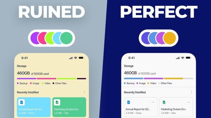
- Are the colors working together?
- Are the visual effects necessary?
- Is the design consistent with the brand?
- Does it make sense for the target audience?
- Can anything unnecessary be removed?
If you can confidently answer these questions, your design is much more likely to feel polished and professional.
Remember, professional design isn't about making a design complicated.


Comments (0)
Login to leave a comment.
No comments yet. Be the first to comment!